

Sea Breeze
Inspired by the sea, teal and pale green shades are paired with beige creating this harmonious collection.

Irish Spring
The bright green and blue colors incorporated in this collection mimic the color palette of the Irish coast in spring.

Blue Smoke
The bold yellow-green color featured in this collection brightens up the palette while the darker grey shades create contrast and balance.


Toned-Down
This collection shows that by using muted and toned-down shades, you can incorporate lots of color into your design without it overshadowing other elements. The blue, yellow, and maroon colors that are intertwined in the patterned textile are what inspired the color scheme for this collection.

Terracotta
Oftentimes it can be tricky to pair cooler grey tones with warmer beige and tan colors in a design, but this collection harmoniously unites the two colors. The material choice in this palette features stone, wood and plush wool creating a cozy and home-like feel.

Smoked Tan
Oftentimes it can be tricky to pair cooler grey tones with warmer beige and tan colors in a design, but this collection harmoniously unites the two colors. The material choice in this palette features stone, wood and plush wool creating a cozy and home-like feel.

Juice Cleanse
Choosing neutral-colored wood flooring and countertops allow the colors in this collection to be the focal point. Bright pops of blue, green, and orange bring both a sense of inspiration and peacefulness to the overall design.

Whiskey on the Rocks
The name of this collection, ‘Whiskey on the Rocks’, was inspired by the various rock materials and warm brown tones that are incorporated throughout the palette. These strong materials combined with dark colors give a very masculine appearance to this collection.
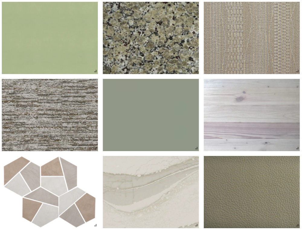
I Love You So Matcha
Light shades of green are a great option if you want to add some color to your design, but don’t want it to become too overpowering. This collection incorporates subtle and muted greens, which create a soothing and zen-like feel.

Mellow Yellow
The textiles in this collection appear to have a grid-like pattern when you look at them on a large-scale, and a checkerboard pattern when looked at on a smaller scale. This complex and intricate pattern grabs your attention pulling you into the other details of the palette, like the veins in the marble and the brass stem on the hand-blown glass pendant.


Urban Jungle
This collection features shades of grey, brown, greige, and pops of green, paired with natural elements like wood. Incorporating the snakeskin textile creates an exotic feel to this natural-looking palette, while the planter and marble products add an urban and modern aspect.

Staying Neutral
Neutral colored finishes offer endless design possibilities and can be paired or accented with just about any color. The materials in this collection range from white and cream colors to dark grey and greige shades. These products work well together, and because of their versatility offer vast opportunities to be incorporated into any design.

Amethyst
Not only is purple known as the color of royalty, it is also known as the color of creativity. Purple can be quiet or dramatic, depending on how you incorporate it into your design. Subtle hints of purple are woven throughout this collection and geometric patterns are added for more depth.

Turquoise
Traditionally turquoise has been associated with the gemstone it is named after. In the design world, it is a beautiful color with a lot of versatility. It can bring an exotic feel, brighten up any space, or bring a modern aspect into a design. In this collection, turquoise paired with light beige and cream colors results in a soothing and calming effect

Black & Gold
Black and Gold is a timeless color pairing that is traditionally used to bring a sense of luxury into a design. A more warm and inviting take on the color pairing is showcased in this collection, as black and gold are combined with natural looking materials and textures.


Valentine’s Day
This collection is inspired by Valentine’s Day and incorporates materials in various shades of pink. The wallpaper, carpet, and paint are stronger shades of pink, while the wood and stone materials are great if you are looking to add a more subtle touch of pink to your design.