

Turquoise
Traditionally turquoise has been associated with the gemstone it is named after. In the design world, it is a beautiful color with a lot of versatility. It can bring an exotic feel, brighten up any space, or bring a modern aspect into a design. In this collection, turquoise paired with light beige and cream colors results in a soothing and calming effect

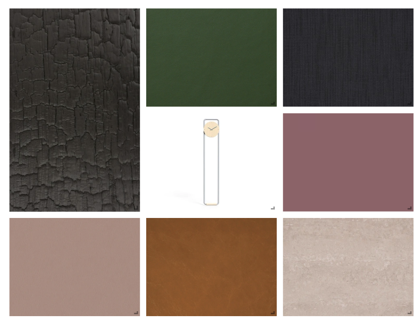
Black & Gold
Black and Gold is a timeless color pairing that is traditionally used to bring a sense of luxury into a design. A more warm and inviting take on the color pairing is showcased in this collection, as black and gold are combined with natural looking materials and textures.


Valentine’s Day
This collection is inspired by Valentine’s Day and incorporates materials in various shades of pink. The wallpaper, carpet, and paint are stronger shades of pink, while the wood and stone materials are great if you are looking to add a more subtle touch of pink to your design.

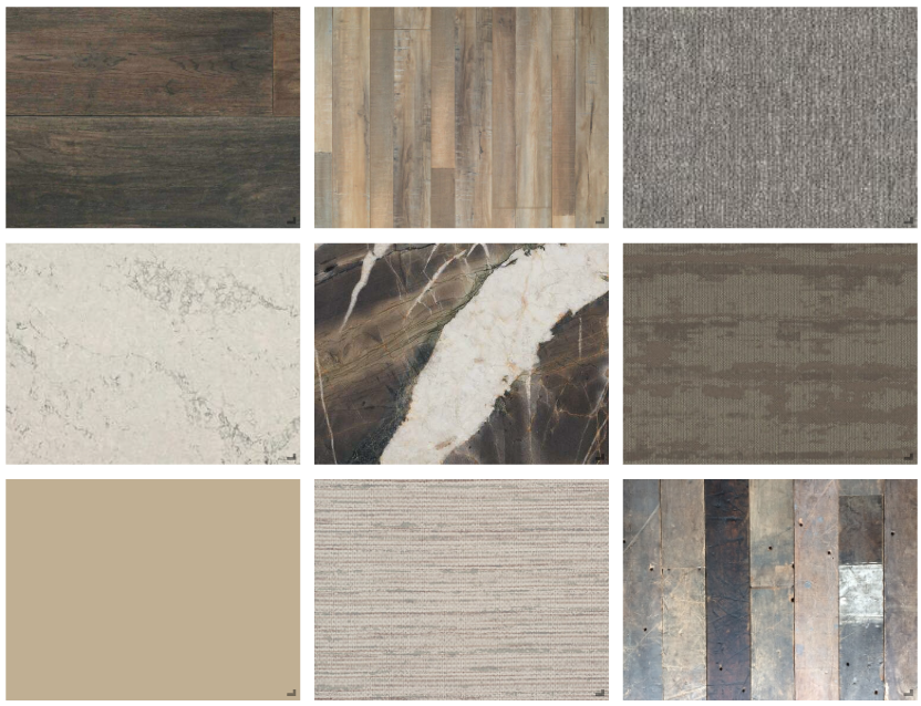
Scandinavian
This Scandinavian inspired collection incorporates light muted colors with natural materials like wood and stone, creating a simple and minimalistic design.


Warm Me Up
Earth tones are paired with hues of yellow, orange, and red to create a warm and inviting feel to this collection. While the color palette is limited to only a few colors, it allows the textures in this collection to stand out.

Pastel Palette
This palette showcases pastel shades of blue, pink, yellow and green. To avoid becoming too muted and soft, darker colors are incorporated to add the element of contrast to the palette.

Primary Palette
Primary colors are the inspiration behind this palette. Red, yellow and blue are complemented with straight lines, and accented with muted countertop and wood finishes.

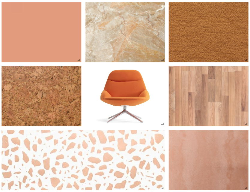
Peachy Keen
This collection exudes warmth and excitement. Bright shades of orange and pink can be used subtly as an accent, or can be used in larger amounts to create a more bold and stimulating design.

Coastal Collection
Natural elements paired with soft shades and pops of blue and green, create a light and airy feel to this coastal inspired collection.

Contemporary Compilation
Simple lines and geometric shapes are combined with dark shades and subtle color, creating a sleek contemporary palette.

Pantone Colors of the Year 2021
In honor of Pantone announcing “Illuminating” and “Ultimate Gray” as the official colors of 2021, we have curated a collection of products that highlight the color pairing.


Color All The Way Palette
This collection pairs blues, greens, yellows and pinks in a harmonious way by incorporating the same muted tone throughout the palette.
Natural High Palette
This palette embraces simple, clean design by using soft shades, raw materials, and minimal color.

Organic Motion Palette
Earth tones, natural textures, and organic forms create a warm and inviting feel to this collection.
