

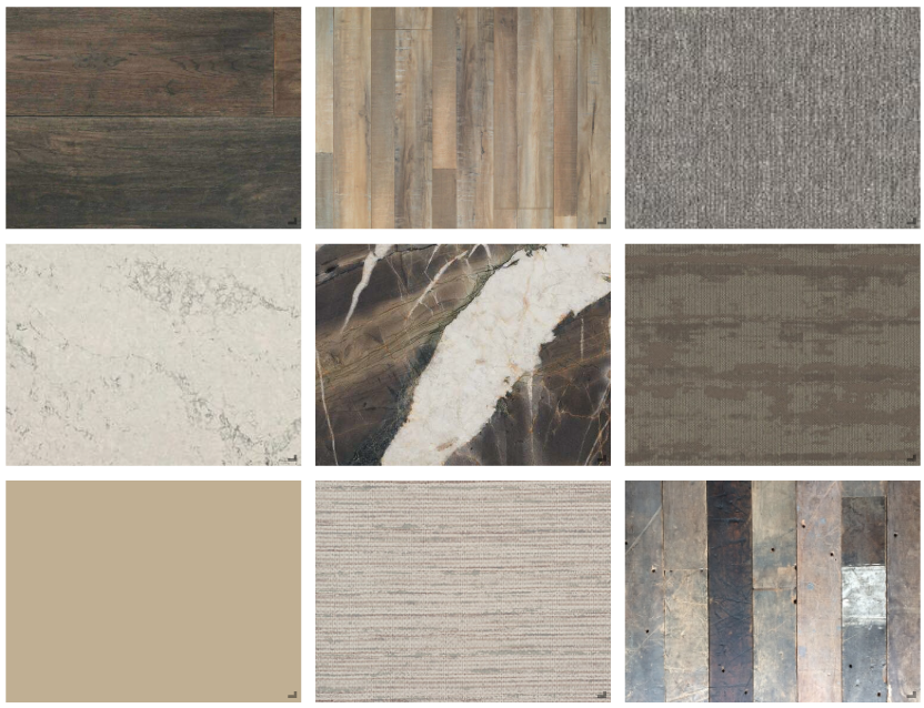
Staying Neutral
Neutral colored finishes offer endless design possibilities and can be paired or accented with just about any color. The materials in this collection range from white and cream colors to dark grey and greige shades. These products work well together, and because of their versatility offer vast opportunities to be incorporated into any design.

Amethyst
Not only is purple known as the color of royalty, it is also known as the color of creativity. Purple can be quiet or dramatic, depending on how you incorporate it into your design. Subtle hints of purple are woven throughout this collection and geometric patterns are added for more depth.

Turquoise
Traditionally turquoise has been associated with the gemstone it is named after. In the design world, it is a beautiful color with a lot of versatility. It can bring an exotic feel, brighten up any space, or bring a modern aspect into a design. In this collection, turquoise paired with light beige and cream colors results in a soothing and calming effect

Black & Gold
Black and Gold is a timeless color pairing that is traditionally used to bring a sense of luxury into a design. A more warm and inviting take on the color pairing is showcased in this collection, as black and gold are combined with natural looking materials and textures.


Valentine’s Day
This collection is inspired by Valentine’s Day and incorporates materials in various shades of pink. The wallpaper, carpet, and paint are stronger shades of pink, while the wood and stone materials are great if you are looking to add a more subtle touch of pink to your design.

Scandinavian
This Scandinavian inspired collection incorporates light muted colors with natural materials like wood and stone, creating a simple and minimalistic design.


Warm Me Up
Earth tones are paired with hues of yellow, orange, and red to create a warm and inviting feel to this collection. While the color palette is limited to only a few colors, it allows the textures in this collection to stand out.

Pastel Palette
This palette showcases pastel shades of blue, pink, yellow and green. To avoid becoming too muted and soft, darker colors are incorporated to add the element of contrast to the palette.

Primary Palette
Primary colors are the inspiration behind this palette. Red, yellow and blue are complemented with straight lines, and accented with muted countertop and wood finishes.